Overview
Reimagining MSIG's legacy Agent portal to include a consumer-grade UX
My Role
Led design strategy and execution for a team consisting of 1 product manager, 2 designers, and 9 developers.
Pain points from user interviews
Data entry was tedious and time consuming.
The current interface was a couple of decades old and used dated and inefficient interaction patterns.
Lack of proactive communication kept the user guessing about the effect of his/her actions.
Lack of mobile support made closing deals on the go difficult.
Solution
Special attention to redesigning forms, data entry workflows and breaking long journeys into multiple steps.
Revamp IA and visual design to improve
responsiveness, scalability and clarity.
Optimize for mobile and tablet usage
to issue and track policies on the go.
Design Principles Used

Optimize for complex and lengthy data entry workflows.

Leverage common and existing interaction patterns to reduce relearning.

Applied accessibility best practices to enhance clarity and navigation for a broad user base, including older adults.
Learnings
While breaking up long forms into steps and sections was beneficial, it sometimes resulted in too many steps which made the workflow appear longer than it was.
Impact
Improved IA, form design and visual hierarchy reduced the average time taken to create a quote by around 3 minutes. This combined with the mobile support allowed the agents to issue and service policies faster and more efficiently.
Overview
Reimagining MSIG's legacy Agent portal to include a consumer-grade UX
My Role
Led design strategy and execution for a team consisting of 1 product manager, 2 designers, and 9 developers.
Pain points from user interviews
Data entry was tedious and time consuming.
The current interface was a couple of decades old and used dated and inefficient interaction patterns.
Lack of proactive communication kept the user guessing about the effect of his/her actions.
Lack of mobile support made closing deals on the go difficult.
Solution
Special attention to redesigning forms, data entry workflows and breaking long journeys into multiple steps.
Revamp IA and visual design to improve
responsiveness, scalability and clarity.
Optimize for mobile and tablet usage
to issue and track policies on the go.
Design Principles Used
Optimize for complex and lengthy data entry workflows.
Leverage common and existing interaction patterns to reduce relearning.
Applied accessibility best practices to enhance clarity and navigation for a broad user base, including older adults.
Learnings
While breaking up long forms into steps and sections was beneficial, it sometimes resulted in too many steps which made the workflow appear longer than it was.
Impact
Improved IA, form design and visual hierarchy reduced the average time taken to create a quote by around 3 minutes. This combined with the mobile support allowed the agents to issue and service policies faster and more efficiently.
Gallery
Dashboard to highlight key stats and numbers.

A new quote journey split into multiple steps, employing the goal gradient effect to make the process feel less tedious.

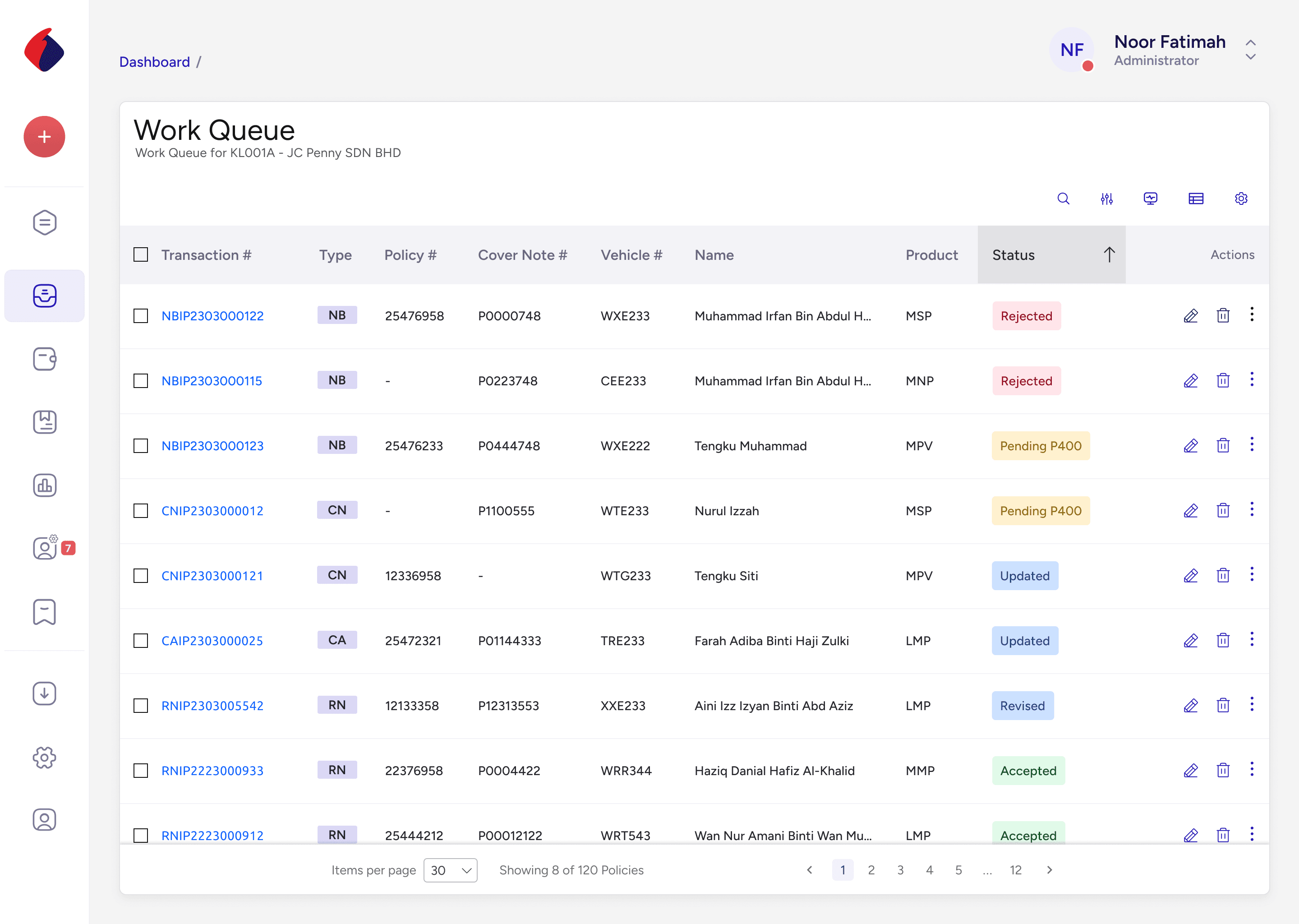
A dense data view
showing the agents work queue.
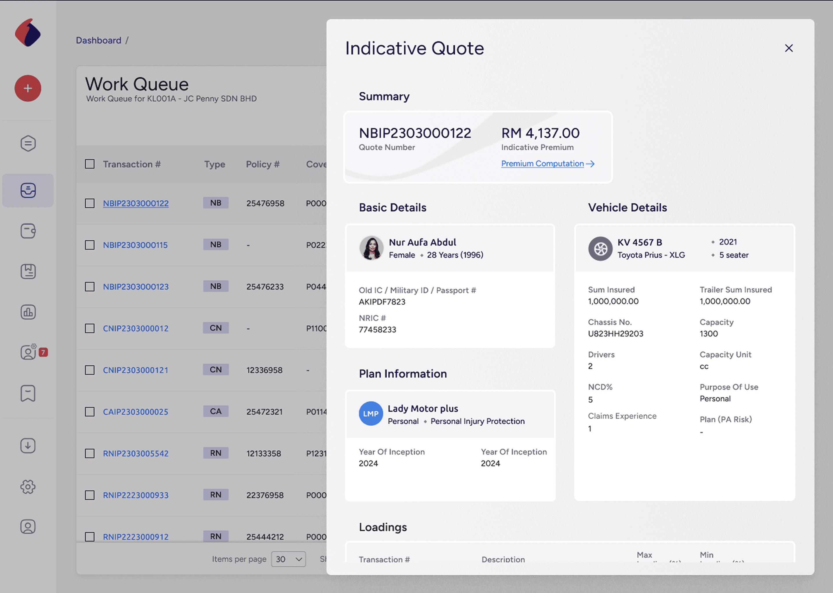
Details sidebars shows details
of any selected item from the work queue above
Gallery
Dashboard to highlight key stats and numbers.
A new quote journey split into multiple steps, employing the goal gradient effect to make the process feel less tedious.
A dense data view
showing the agents work queue.
Details sidebars shows details
of any selected item from the work queue above