Overview
Improving discoverability of 1Finance's mobile app, simplifying the process for users to effortlessly find their ideal financial advisors.
My Role
Led design strategy and execution for a team consisting of 1 product manager and 3 designers
Pain points from user interviews
Users couldn't locate key features like booking and scheduling an appointment with an advisor.
The existing dashboard was too dense, making it difficult to surface key important features or and track key numbers.
Solution
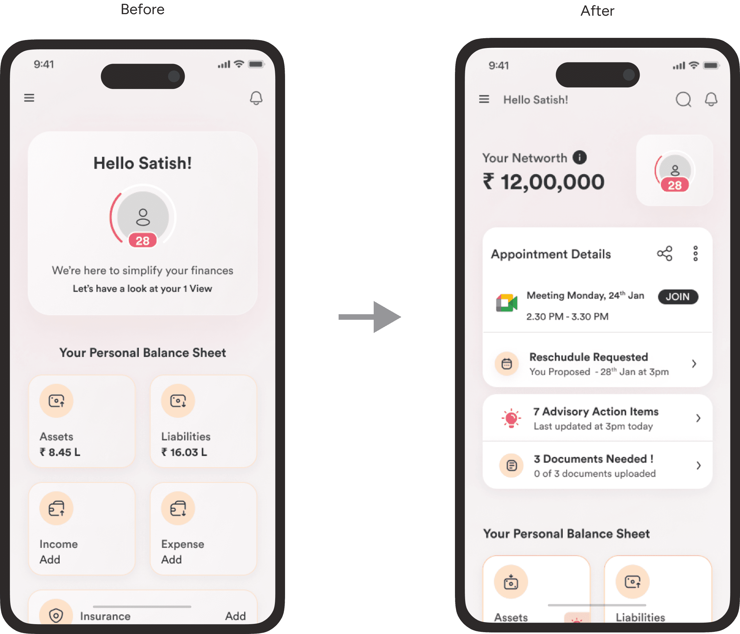
Personalizing the dashboard to surface information specific to the user and his/her context.
Enhancing usability by prioritizing content on the assets page.
Improving information scent to improve discoverability.
Design Principles Used

Personalize

Prioritize Key Information

Be simple, easy to use, and guiding
Impact
25% decrease in no-shows after redesigning the dashboard and assets pages for better clarity and usability.
Overview
Improving discoverability of 1Finance's mobile app, simplifying the process for users to effortlessly find their ideal financial advisors.
My Role
Led design strategy and execution for a team consisting of 1 product manager and 3 designers
Pain points from user interviews
Users couldn't locate key features like booking and scheduling an appointment with an advisor.
The existing dashboard was too dense, making it difficult to surface key important features or and track key numbers.
Solution
Personalizing the dashboard to surface information specific to the user and his/her context.
Enhancing usability by prioritizing content on the assets page.
Improving information scent to improve discoverability.
Design Principles Used

Personalize

Prioritize Key Information

Be simple, easy to use, and guiding
Impact
25% decrease in no-shows after redesigning the dashboard and assets pages for better clarity and usability.
Gallery
Improved the dashboard view by :
Added a compact view for displaying stats, making it easier to understand critical metrics at a glance.
Prioritizing and highlighting upcoming appointment information to simplify call management and rescheduling.
Incorporated prerequisites for calls within the appointment details card.

Enhanced the CTA for understanding the user's financial score,
providing a clear breakdown and actionable steps for improvement.

Making call to actions and missing items obvious and clear.

Improved the assets page by :
Adding additional category of baskets and mutual funds.
Moving Transactions and Explore to separate screen as they are less frequently used.
Adding a minimized state for the "current" value card to get a more compact view.

New Transaction Page that shows the history of all the transactions done by the user.

Various states of the Appointment Details Card component make all call-related information easier to access and manage.

Gallery
Improved the dashboard view by :
Added a compact view for displaying stats, making it easier to understand critical metrics at a glance.
Prioritizing and highlighting upcoming appointment information to simplify call management and rescheduling.
Incorporated prerequisites for calls within the appointment details card.

Enhanced the CTA for understanding the user's financial score,
providing a clear breakdown and actionable steps for improvement.

Making call to actions and missing items obvious and clear.

Improved the assets page by :
Adding additional category of baskets and mutual funds.
Moving Transactions and Explore to separate screen as they are less frequently used.
Adding a minimized state for the "current" value card to get a more compact view.

New Transaction Page that shows the history of all the transactions done by the user.

Various states of the Appointment Details Card component make all call-related information easier to access and manage.
